
Homepage layouts.
Choose between Smart wallet, Showcase, Portal, and Public listing without changing the loyalty programs behind them.
On this page
The member homepage can serve four different jobs. It can present a curated wallet, tell one brand's story, provide a quiet sign-in gateway, or help visitors search a public directory. The loyalty programs and member accounts behind the page do not change when you switch layouts.
This choice is separate from the shared wallet architecture. One installation can still serve one business or many isolated businesses. The layout decides what a visitor sees before signing in.
Choose by visitor intent
| Layout | The visitor came to... | Strongest fit |
|---|---|---|
| Smart wallet | See a curated set of cards and understand the wallet | One business with several campaigns; a small, intentional network |
| Showcase | Meet the brand and browse its programs | A single business, focused brand, or campaign-led landing page |
| Portal | Sign in or open their wallet | Agencies with unrelated clients; QR-first flows; an app behind another website |
| Public listing | Search for a business or offer | Marketers, districts, malls, associations, and public program networks |
The number of businesses alone does not decide the layout. A single business may prefer Smart wallet, Showcase, or Portal. A multi-business operator may choose Portal to keep clients out of a shared storefront, Smart wallet to feature a small approved collection, or Public listing when discovery is part of the product.
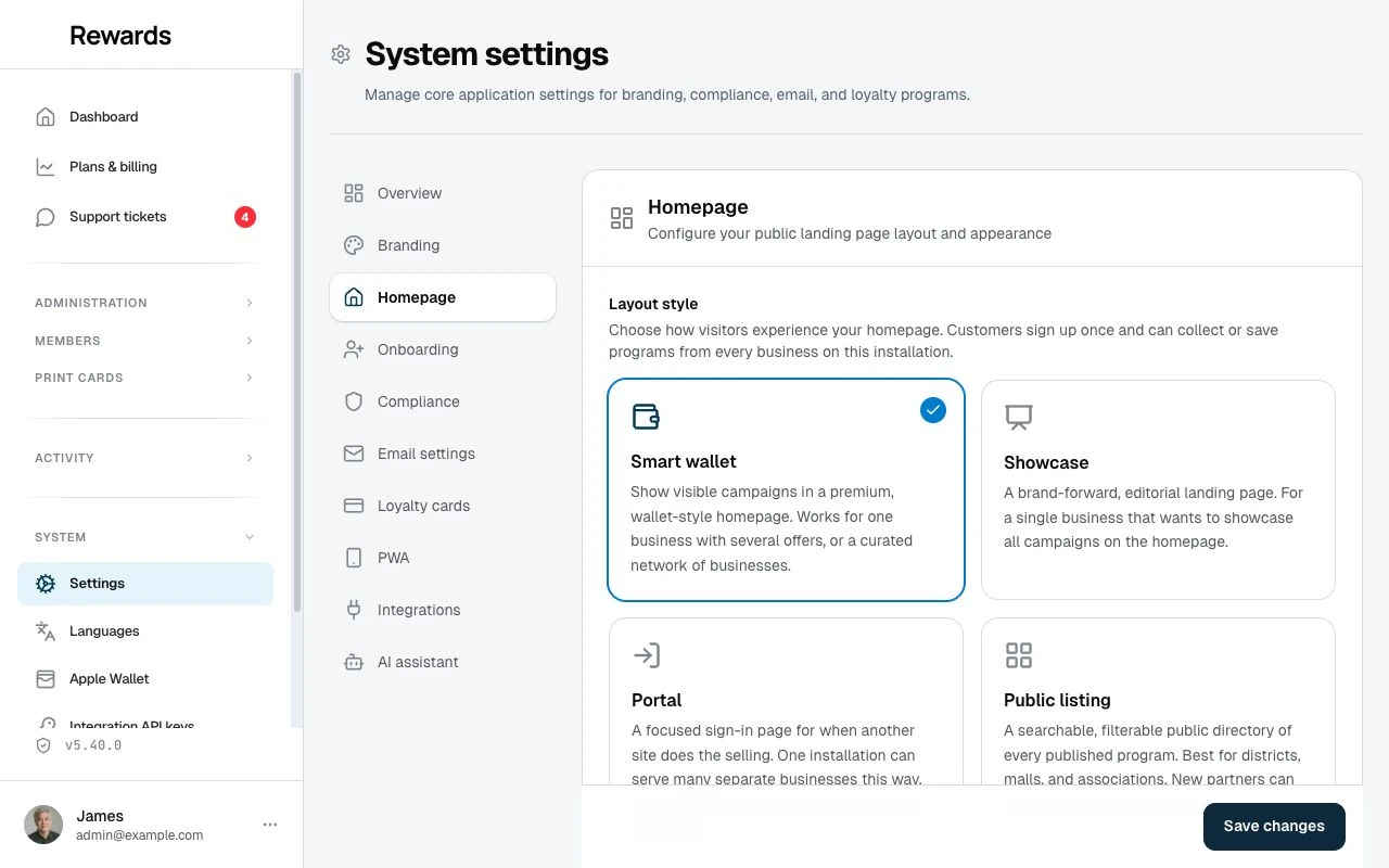
A practical starting point
- Agency with unrelated clients: Start with Portal. Each client promotes their own programs by direct link or QR code, while the homepage reveals no common directory.
- Marketer or place-based operator: Start with Public listing when search and discovery are the campaign. Use Smart wallet instead when you want to feature a smaller editorial selection.
- Single business: Choose Showcase for a brand landing page, Smart wallet for a card-led experience, or Portal when another website and your in-store material already explain the offer.
- Franchise or complementary network: Choose Smart wallet for a curated collection. Choose Public listing when visitors need to find a location or program among many.
Homepage visibility control
Smart wallet, Showcase, and Public listing all draw from the same published set. A program appears after every required layer allows it:
- Plan eligibility: The partner's plan includes Cards on homepage. It is off in every shipped tier; switch it per tier under Settings → Set up plans in the Plans editor.
- Admin decision: An administrator can grant or revoke homepage publishing for a specific partner under Partner permissions.
- Partner choice: An eligible partner turns on Visible on homepage for each loyalty card, stamp card, voucher, or prepaid pass they want to publish.
| Layer | Controls | Default |
|---|---|---|
| Plan | Whether partners on the plan may publish | Off |
| Admin override | Whether one partner may publish | Inherits the plan unless overridden |
| Program toggle | Which of that partner's programs appear | Off |
The app checks eligibility whenever it renders the homepage. Deactivating a business or network, revoking the permission, or changing the plan removes its programs without requiring the partner to edit each item.
Cards on homepage follows the same layers over time: a partner who already holds it keeps the publish toggle until their plan or permission changes, and published programs leave the homepage the moment eligibility goes. Once no active plan offers it and no partner holds a grant, the My plan comparison stops listing it.
Portal is different: it does not show a public program collection at all. Direct program links and QR codes still work.
Smart wallet
Smart wallet leads with one clear promise and a signature wallet card. Compact category links take visitors to the published points, stamp, voucher, and prepaid sections below.
Use it when the cards themselves are the story: one business showing a considered set of campaigns, or several complementary businesses you chose to present together. The layout shows the programs you approved and never turns them into a public directory.
Read the Smart wallet homepage guide.
Showcase
Showcase is a brand-led landing page with an editorial hero, selected program cards, optional explainer and tier sections, and a closing invitation. It suits a single business or a controlled brand experience.
Read the Showcase homepage guide.
Portal
Portal is a focused gateway for sign-in and account creation. It presents no program listing, making it a strong default when an agency serves unrelated businesses or another website and in-store material already do the selling.
Read the Portal homepage guide.
Public listing
Public listing turns the approved program set into a searchable, filterable directory. Visitors can search program and business names, filter by program type, and sort the complete catalogue.
Use it when public discovery is a selling point: a district, mall, association, tourism campaign, local marketplace, or any marketer building a destination around participating businesses and offers.
Read the Public listing homepage guide.
Configure the layout
Open Settings → Homepage in the admin dashboard, choose a layout, and save. The change takes effect at once.
The .env baseline is HOMEPAGE_LAYOUT:
| Layout | Value |
|---|---|
| Smart wallet | directory |
| Showcase | showcase |
| Portal | portal |
| Public listing | public_listing |
A value that differs from the server default is saved as an application override. Reset to default removes the layout override and preserves the uploaded hero image. The historical value directory means Smart wallet; Public listing has its own public_listing value.
Showcase controls
Selecting Showcase reveals four settings:
| Option | What it changes |
|---|---|
| Hero background image | Adds an uploaded JPG, PNG, or WebP image behind the hero; maximum 5 MB |
| Show How It Works | Shows or hides the short explainer |
| Show Tiers | Shows or hides the membership-tier preview |
| Show Member Count | Shows or hides the number of registered members |
The three switches use .env baselines when the dashboard has no saved value:
HOMEPAGE_SHOW_HOW_IT_WORKS=true
HOMEPAGE_SHOW_TIERS=true
HOMEPAGE_SHOW_MEMBER_COUNT=false
Edit the hero headline and subheadline for each language in Languages & translations: search for showcase_headline or showcase_subheadline.
Public listing controls
Selecting Public listing reveals its own settings:
| Option | What it changes |
|---|---|
| Enable discovery | Turns on the discovery layer: business locations, city and category filters, open-hours status, the one-time Near me option, discovery rows, poster QR codes, and structured business data. Off by default. |
| Listing title | The heading at the top of the listing, one field per active language. Empty fields fall back to the default language, then to the built-in text. Maximum 80 characters. |
| Listing supporting line | The short line under the heading, per active language. Maximum 160 characters. |
| Show discovery rows | Adds New this month and Ending soon rows above the catalogue when no search or filter is active. Off by default. Needs discovery on. |
| Distance unit | How distances appear after a member uses Near me: automatic per language, metric, or imperial. |
The switches and the distance unit use .env baselines when the dashboard has no saved value:
FEATURE_LISTING_DISCOVERY=false
HOMEPAGE_LISTING_SHOW_DISCOVERY_RAILS=false
LISTING_DISTANCE_UNIT=auto
With discovery on, partners can set a category and a precise map point under Business settings → Location, and a multi-location business can give one location its own public place. The Public listing homepage guide explains what visitors see, what Near me sends, and what it never keeps.
Public listing and new partners
When Public listing is active, a partner who self-registers receives homepage-publishing eligibility. The partner still chooses which programs to publish. Existing partners keep their current permissions when you switch to or from this layout.
Mobile and installed-app behavior
All four layouts are responsive. The selected layout is also the starting page when a member installs the progressive web app:
- Smart wallet uses swipeable card rows on phones and keeps its category links within reach.
- Showcase condenses its editorial sections and program grids.
- Portal keeps its sign-in action large and central.
- Public listing reflows its directory and keeps search and filters within reach.
Branding and copy
The application name, logo, and brand color come from Branding. Showcase also provides homepage-specific options for its hero image and supporting sections. Edit the homepage headings for each language in Languages & translations.
Technical reference
Each layout has its own Blade template:
| Layout | Template |
|---|---|
| Smart wallet | resources/views/member/home.blade.php |
| Showcase | resources/views/member/home-showcase.blade.php |
| Portal | resources/views/member/home-portal.blade.php |
| Public listing | resources/views/member/home-public-listing.blade.php |
The homepage renders from current settings and publication eligibility. Switching layouts does not require a cache clear.
Related
- The shared wallet concept: One member identity across isolated businesses
- Who is this for?: Business models and recommended layouts
- Partner permissions: Control who may publish programs
- Branding: Application name, logo, and colors