Designing your cards.
Customize the look and feel with logos, backgrounds, and icons
Visual design makes your stamp cards memorable and engaging. Upload custom images, choose recognizable icons, and create a branded experience that customers love.
Visual elements
Your stamp card includes several customizable visual elements:
- Logo: Your business or program logo
- Background: A full-card background image, or a background colour
- Text colour: The colour of the text on the card
- Stamp icon: The symbol shown on each stamp
The stamps themselves are frosted glass: they render as a soft, translucent overlay that sits on any background (light or dark, photo or solid colour) and stay consistent from the card face to the progress view. There is nothing to choose: you no longer set stamp colours by hand, so your stamps always look right.
Google Wallet: If you enable Google Wallet on this stamp card, the wallet pass uses your logo and background color. Stamp card passes do not use the background image (Google's Generic pass type does not support hero images). Upload a logo to avoid a generic icon. See Google Wallet Pass Design for details.
All of these live on the Design tab of the stamp card form.
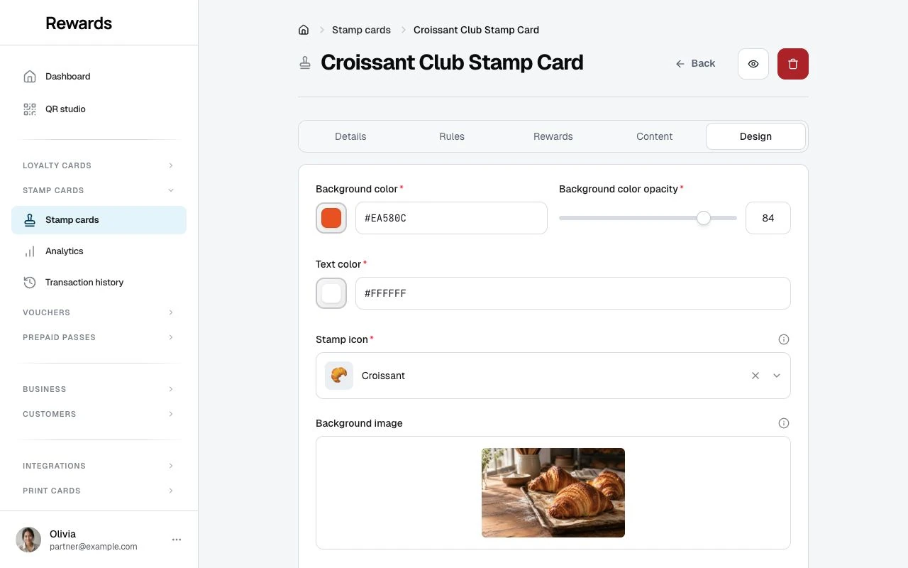
Background and text colors
Background color
Field: Background color
Default: #047857
The card's base color, chosen with a color picker. Without a background image it fills the card; with one, it lies over the image as a tinted overlay (see opacity below).
Text color
Field: Text color
Default: #FFFFFF
The color of the title, description, and progress text on the card face. Keep strong contrast with your background color and image.
Choosing stamp icons
Icon picker
Stamp cards use emoji as stamp icons, so you can choose from a large set of recognized symbols.
To select an icon:
- Open the Stamp icon picker on the Design tab
- Browse the categories Popular, Food, Retail, Services, Rewards, and Emojis, or search
- Click your preferred icon
- See the live preview on the stamp card
The default icon is ⭐.
Stamp count options
Choose from six curated stamp counts, each designed for the best visual display:
| Stamps | Grid Layout | Best For |
|---|---|---|
| 5 | 5×1 (single row) | Quick rewards, simple programs |
| 6 | 3×2 grid | Balanced, compact design |
| 8 | 4×2 grid | Popular choice, symmetrical |
| 9 | 3×3 grid | Perfect square, premium feel |
| 10 | 5×2 grid | Traditional loyalty programs |
| 12 | 4×3 grid | Extended programs, higher value rewards |
The six counts are curated so your stamp cards always display balanced, pixel-perfect grids that look professional on all devices.
Icon recommendations by industry
Coffee Shops: ☕ Coffee cup (classic choice) 🥤 Beverage cup 🍵 Tea cup
Restaurants: 🍕 Pizza slice 🍔 Burger 🍽️ Plate and utensils 🥘 Food bowl
Retail: 🛍️ Shopping bag 🎁 Gift box 👕 Clothing 📦 Package
Services: ✂️ Scissors (salon) 🔧 Wrench (repair) 💆 Spa/massage 🏋️ Fitness
General Loyalty: ⭐ Star (universal) 💎 Diamond (premium) 🏆 Trophy (achievement) ✨ Sparkles (special)
Icon best practices
Choose recognizable symbols: Customers should recognize what your business offers.
Ensure cross-platform compatibility: Test that your icon displays on iOS, Android, and web browsers.
Consider light and dark mode: Some emojis look different in dark mode. Preview both.
Match your brand: The icon should align with your business identity and the reward offered.
Keep it simple: Avoid complex icons that don't hold up at small sizes.
Uploading logo images
Logo specifications
Format: JPEG, PNG, JPG, or GIF Size limit: 20 MiB, subject to lower hosting limits Dimensions: 20×20 minimum, 800×800 maximum Aspect ratio: 1:1 (square) works best
Logo design tips
Use the full allowed size: Upload close to 800×800px for crisp display on all devices.
Square format works best: Circular or square logos fit best. Horizontal logos may be cropped.
Transparent backgrounds: PNG with transparency looks professional and adapts to any background.
Ensure readability: Logo should be clear at small sizes.
Brand consistency: Use your official logo for recognition and trust.
Uploading process
- Go to the Design tab in your stamp card form
- Click Choose File under Logo
- Select your image file
- Preview appears
- Adjust if needed or confirm
To replace:
- Click Remove on current logo
- Upload new image
Adding background images
Background specifications
Format: JPEG, PNG, JPG, or GIF Size limit: 20 MiB, subject to lower hosting limits Dimensions: 320×240 minimum, 1920×1440 maximum Aspect ratio: Horizontal images work best
Background design tips
Choose relevant imagery:
- Coffee beans for coffee shops
- Food photography for restaurants
- Product shots for retail
- Lifestyle images for services
Ensure good contrast: Background should not make text unreadable. Use the opacity slider to adjust.
Avoid busy patterns: Simple, clean backgrounds work better than complex patterns.
Test on mobile: Backgrounds look different on small screens. Preview on various devices.
Brand alignment: Use images that reflect your brand aesthetic and values.
Background color opacity
Field: Background color opacity Range: 0-100% Default: 75%
Controls how much your background color tints the card. With a background image, the color sits over the image as an overlay: the higher the value, the more the color covers the photo and the easier the text reads.
Lower values (30-50%):
- The photo shows through
- The color adds a light wash
- Text needs a high-contrast image to stay readable
Medium values (50-75%):
- Balanced: the image adds atmosphere, the color keeps text clear
- A safe zone for most photos
Higher values (75-100%):
- The color dominates and the image becomes a texture
- Maximum text readability
Recommendation: Start at the default 75% and lower it until the image shows through as much as you want, checking the text stays readable.
Uploading process
- Open the Design tab
- Click Choose File under Background
- Select your image
- The preview appears with the current color overlay
- Adjust the opacity slider
- The preview updates as you go
- Save when satisfied
Design examples
Coffee shop
Logo: Coffee shop logo (circular, brown tones) Background: Coffee beans close-up Opacity: 50% Icon: ☕ Coffee cup Result: Warm, inviting, coffee-focused
Restaurant
Logo: Restaurant logo (elegant script) Background: Plated dish photography Opacity: 40% Icon: 🍽️ Plate and utensils Result: Appetizing, upscale, food-focused
Retail store
Logo: Store logo (modern, colorful) Background: Product display or store interior Opacity: 55% Icon: 🛍️ Shopping bag Result: Vibrant, shopping-oriented, brand-forward
Spa/wellness
Logo: Spa logo (calming, minimal) Background: Zen stones or peaceful scene Opacity: 45% Icon: 💆 Massage symbol Result: Relaxing, serene, wellness-focused
Responsive design considerations
Your stamp card displays on various screen sizes:
Mobile (most common):
- Logo: 80-100px
- Background: Scales to fit
- Icon: 40-50px per stamp
Tablet:
- Logo: 100-120px
- Background: Wider display
- Icon: 50-60px per stamp
Desktop:
- Logo: 120-150px
- Background: Full width
- Icon: 60-80px per stamp
Design for mobile first: Ensure your logo and background look great on small screens, and they'll scale to larger displays.
Accessibility considerations
Color contrast
Ensure sufficient contrast between:
- Text and background
- Logo and background
- Icons and background
Test with:
- Light mode
- Dark mode
- Various screen brightness levels
Visual clarity
Avoid:
- Light text on light backgrounds
- Dark text on dark backgrounds
- Low-contrast color combinations
Prefer:
- High contrast
- Clear, legible fonts
- Simple, recognizable icons
Updating design elements
Editing existing stamp cards
To update visual elements on an active stamp card:
- Go to the Stamp cards list
- Click Edit on the program
- Go to the Design tab
- Upload new images or change colors and opacity
- Click Save
Changes take effect at once:
- Customers see updated design
- Existing enrollments retain progress
- No impact on stamp counts or rewards
A/B testing designs
Test different visual approaches:
Create variations:
- Create a second stamp card with the same rules and rewards
- Change only the visual elements
- Run both programs at the same time
- Compare enrollment and completion rates
Analyze results:
- Which design attracts more enrollments?
- Which has higher completion rates?
- Which generates more customer feedback?
Implement winners:
- Keep the best-performing design
- Deactivate underperforming variations
- Apply learnings to future programs
Image optimization
File size
Keep images under recommended limits:
- Logos: 500KB or less
- Backgrounds: 2MB or less
Benefits:
- Faster page loading
- Better mobile experience
- Reduced bandwidth usage
Tools for compression:
- TinyPNG (online)
- ImageOptim (Mac)
- Squoosh (web-based)
Format selection
PNG:
- Best for logos with transparency
- Supports alpha channel
- Larger file sizes
JPG:
- Best for photographic backgrounds
- Smaller file sizes
- No transparency support
GIF:
- Accepted, but not often the right choice
- Limited colors and larger files than JPG for photos
Recommendation: PNG for logos, JPG for photos. The stamp card uploads accept JPEG, PNG, JPG, and GIF; they do not accept WebP.
Troubleshooting design issues
"Image file too large"
Cause: File exceeds size limit Solution: Compress image before uploading
"Image appears stretched"
Cause: Wrong aspect ratio Solution: Use recommended dimensions (square for logo, 2:1 for background)
"Text is unreadable"
Cause: The photo shows through too much Solution: Raise the background color opacity toward 75-90% so the color overlay carries the text, or pick a text color with more contrast
"Logo looks blurry"
Cause: Low resolution image Solution: Upload higher resolution (minimum 500x500px)
"Background doesn't display"
Cause: File format not supported or upload failed Solution: Use JPEG, PNG, JPG, or GIF and try uploading again
Next steps
- Monitoring Performance: Track how design affects engagement
- Best Practices: Design tips for maximum impact
- Creating Your First Program: Complete setup guide