Activity analytics.
Understanding activity metrics, charts, and trends
The Activity Analytics dashboard turns your audit trail into visual insights. See activity patterns, identify trends, and understand how your platform is being used, all at a glance.
Accessing the dashboard
Administrators: Open Activity → Analytics in the admin sidebar.
Partners: Open Business → Activity log analytics to view your business activity.
The dashboard loads with data from the last 30 days by default.
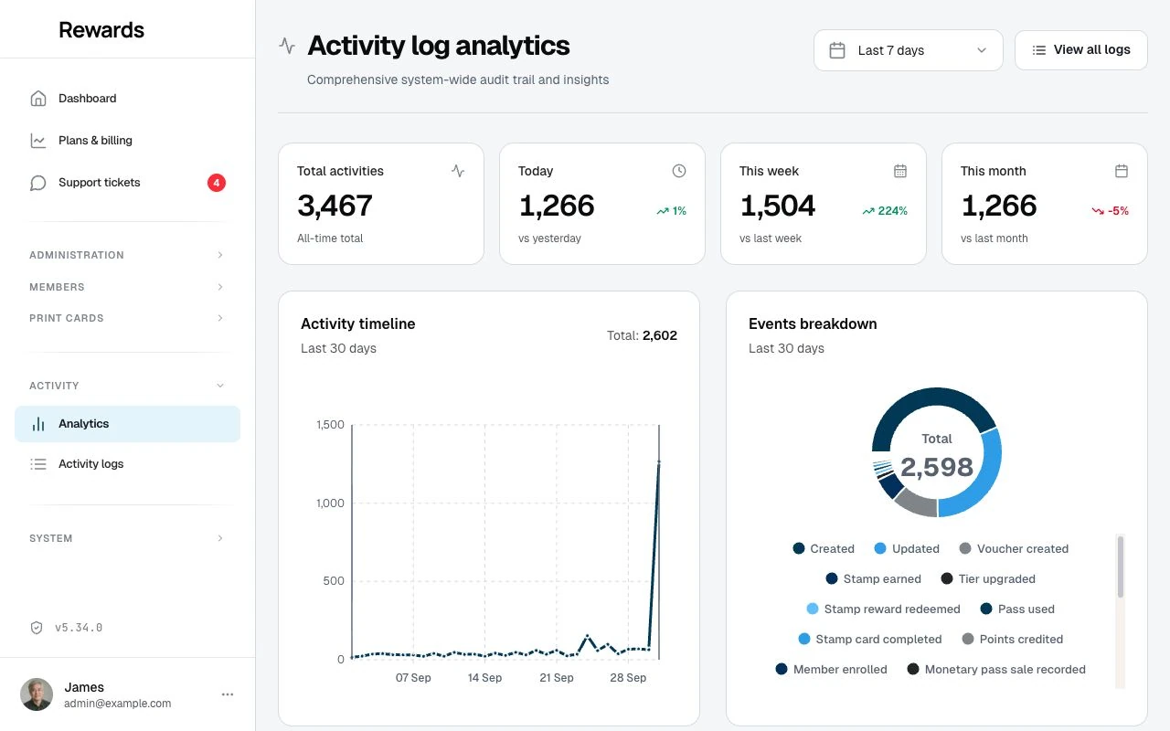
Changing the time range
Use the date range selector in the top-right corner to adjust the view:
| Range | Use Case |
|---|---|
| Last 7 days | Recent activity snapshot |
| Last 14 days | Two-week overview |
| Last 30 days | Monthly patterns (default) |
| Last 90 days | Quarterly trends |
| Last year | Annual activity analysis |
The selected range controls the timeline, breakdowns, most-active users, and authentication statistics. Summary cards retain their all-time, today, week, and month periods. Recent activity remains the latest ten records.
Understanding the metrics
Activity overview cards
Four metric cards show key statistics:
Total Activities The count of activity records still stored. Purging old logs can reduce it.
Today Activities recorded today, with a percentage comparison to yesterday.
- Green arrow (↑) = more activity than yesterday
- Red arrow (↓) = less activity than yesterday
This Week Activities in the current week, compared to last week. Helps identify weekly patterns.
This Month Activities in the current month, compared to last month. Useful for spotting monthly trends.
The timeline below shows how activity changes across the selected range.
Percentage changes
Percentage indicators show how current activity compares to the previous period:
| Indicator | Meaning |
|---|---|
| Green with ↑ | Activity increased |
| Red with ↓ | Activity decreased |
| Gray with – | No change |
| No percentage | The previous period had zero activity |
Example: If today shows "+45%" in green, you have 45% more activity today than yesterday.
Reading the charts
Activity timeline
The area chart shows daily activity over your selected time range on a clean date axis. Rather than labeling every day, it shows a handful of dates at regular intervals with muted week or month markers behind the line, so the trend stays readable whether you are viewing a week or a full year. Shorter ranges mark each day with a point; longer ranges settle into weekly and monthly boundaries. Hover any point for that day's exact date and count.
What to look for:
- Spikes: Unusually high activity days
- Dips: Unusually quiet days
- Patterns: Regular weekly or monthly cycles
- Trends: Overall increase or decrease over time
Events breakdown
This donut chart shows the distribution of event types:
| Event | Color | Description |
|---|---|---|
| Created | Green | New records added |
| Updated | Amber | Existing records modified |
| Deleted | Red | Records removed |
| Login | Blue | Successful authentications |
| Logout | Gray | User sign-outs |
| Login Failed | Red | Failed authentication attempts |
What it tells you: Use the detailed logs to explain a change. For example, planned data cleanup can increase deletions.
Monetary pass events also appear by their translated event labels. These charts count activity copies; they do not calculate outstanding value or external cash totals. Use prepaid pass analytics for monetary reconciliation.
Categories breakdown
Horizontal bars show which resources are most active:
| Category | Description |
|---|---|
| Cards | Loyalty card and stamp card activities |
| Members | Member account activities |
| Rewards | Reward activities |
| Staff | Staff account activities |
| Authentication | Login/logout events |
| Clubs | Club/program activities |
| Transactions | Points/stamps transactions |
| Networks | Network activities |
What it tells you: This reveals where most work is happening. High card activity might indicate active partner onboarding. High member activity suggests growing user engagement.
User types breakdown
Horizontal bars show activity by user role:
| User Type | Description |
|---|---|
| Partner | Activities by business owners |
| Staff | Activities by employees |
| Admin | Activities by administrators |
| Member | Activities by customers |
| System | Automated processes |
What it tells you: See which roles account for recorded activity. System activity can include scheduled work; activity counts alone do not measure business growth.
Most active users
A leaderboard showing your top 10 most active users during the selected time range. Each entry shows:
- User name
- User type (Admin, Partner, Staff, Member)
- Activity count
Use this to:
- Recognize highly engaged partners
- Identify power users
- Spot unusually high activity from a single account
Recent activity
The last 10 activities recorded in your system, displayed with:
- Category icon and badge
- Description of what happened
- How long ago it occurred
Use this to:
- Monitor real-time activity
- Spot recent changes
- Stay aware of platform usage
Authentication statistics
This section shows login security metrics:
| Metric | Description |
|---|---|
| Total Logins | Successful authentication count |
| Total Logouts | User sign-out count |
| Failed Logins | Failed authentication attempts |
What to watch for: A sudden spike in failed logins from the same IP address could indicate a brute-force attack. See Security Monitoring for details.
Using analytics
Daily monitoring
Check the dashboard often to:
- Understand normal activity patterns
- Spot unusual spikes or dips
- Monitor failed login attempts
- Track platform growth
Investigating anomalies
When you see unusual patterns:
- Note the date of the spike or dip
- Click View All Logs to see detailed records
- Filter by date range to narrow down
- Review individual activities for context
Comparing periods
Use different time ranges to compare:
- Week over week for short-term trends
- Month over month for seasonal patterns
- Year over year for growth analysis
Related topics
- Activity logs overview: Introduction to activity logging
- Viewing logs: Search and filter detailed records
- Security Monitoring: Use logs for security analysis