Voucher card design & branding.
Customize voucher appearance with background colors, images, opacity, and logos.
A well-designed voucher catches attention and reinforces your brand. Customize colors, images, and logos to create vouchers that look professional and match your business identity.
Voucher card anatomy
Voucher cards display consistently across devices with a 4:3 aspect ratio:
┌────────────────────────────────┐
│  [Logo]          [Status Badge]│
│                                │
│     ██  20% OFF  ██            │
│                                │
│   Summer Sale                  │
│   Code: SUMMER20               │
│                                │
│   Expires: Aug 31, 2025        │
└────────────────────────────────┘
Your customizations affect the background and branding elements. The app fills in the discount, title, code, and expiration from your voucher settings.
Google Wallet: If you enable Google Wallet on this voucher, your logo, background color, and background image are reused for the wallet pass. The logo falls back to your partner logo if not uploaded on the voucher. See Google Wallet Pass Design for details.
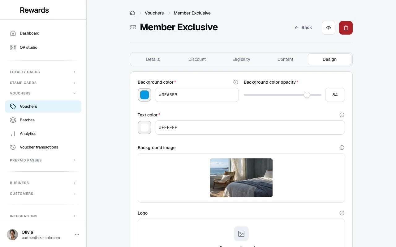
Background color
The primary visual element of your voucher card.
Choosing a color
Click the color picker or enter a hex code:
| Input | Result |
|---|---|
| Click picker | Visual color selection |
| #7C3AED | Purple |
| #10B981 | Green |
| #F59E0B | Amber |
| #EF4444 | Red |
Brand alignment
Use colors that match your brand:
- Primary brand color: Creates consistency
- Seasonal colors: Red/green for holidays, pastels for spring
- Campaign-specific: Different colors for different promotions
Contrast considerations
Ensure text is readable against your background:
| Background Color | Recommended Text Color |
|---|---|
| Dark (navy, black, purple) | White (#FFFFFF) |
| Light (white, yellow, light gray) | Black (#000000) |
| Medium (blue, green, red) | White usually works best |
Background opacity
Control how solid your background color appears.
How it works
Opacity ranges from 0 (transparent) to 100 (solid).
| Opacity | Effect |
|---|---|
| 100 | Solid color, no image visible |
| 85 | Recommended: color dominant, slight image visibility |
| 70 | Balanced: both color and image visible |
| 50 | Equal blend |
| 30 | Image dominant, color tint |
Default: 85%
The default 85% opacity works well for most cases:
- Background color is prominent
- Background image adds subtle texture
- Text stays easy to read
With and without images
No background image: Opacity only affects color intensity (minimal visual difference)
With background image: Opacity creates overlay effect, blending color and image
Text color
Control the color of text displayed on the voucher card.
Standard options
| Use Case | Hex Code | When to Use |
|---|---|---|
| White text | #FFFFFF | Dark backgrounds (most common) |
| Black text | #000000 | Light backgrounds |
Testing readability
Always preview your voucher after setting colors. Ask yourself:
- Can I read the discount amount?
- Is the voucher code visible?
- Does the title stand out?
If not, adjust your text color or background opacity.
Background image
Add visual interest with a custom background image.
Image requirements
| Attribute | Requirement |
|---|---|
| Dimensions | 320×240 minimum, 1920×1440 maximum |
| Recommended | 800×600 pixels, 4:3 (matches card ratio) |
| File Types | JPG, PNG, GIF |
| Max Size | 20 MiB, subject to lower hosting limits |
Image selection tips
Good background images:
- Product photography (blurred or styled)
- Lifestyle images related to your business
- Seasonal or thematic graphics
- Abstract patterns or textures
- Your storefront or venue
Avoid:
- Busy images with too much detail
- Images with text (conflicts with voucher text)
- Low-resolution or pixelated images
- Images unrelated to your brand
How images display
Images are:
- Scaled to fill the card area
- Cropped to 4:3 ratio (centered)
- Overlaid with background color at specified opacity
- Text rendered on top
No image alternative
Without a background image, the voucher displays as a solid color card with optional gradient effects. This looks clean and professional. Many successful vouchers use color-only designs.
Logo
Add your brand logo to the voucher card.
Logo requirements
| Attribute | Requirement |
|---|---|
| Dimensions | 20×20 minimum, 800×800 maximum |
| Aspect Ratio | 1:1 (square) recommended |
| File Types | PNG (transparent background ideal), JPG, GIF |
| Max Size | 20 MiB, subject to lower hosting limits |
Logo placement
Logos display in the top corner of the voucher card, sized so they don't overwhelm the design.
Logo tips
- Use transparent PNG: Blends better with background
- Keep it simple: Complex logos may not render well at small sizes
- Ensure contrast: Logo should be visible against your background
- Consider a light/dark version: Some logos need inverting for certain backgrounds
Design examples
Bold color, no image
Background Color: #7C3AED (purple)
Opacity: 100
Text Color: #FFFFFF (white)
Logo: Brand logo (white version)
Clean, modern, professional. The color does all the work.
Lifestyle image
Background Color: #000000 (black)
Opacity: 50
Background Image: Coffee shop ambiance photo
Text Color: #FFFFFF (white)
Logo: Coffee shop logo
Atmospheric and inviting. Image creates mood, color ensures readability.
Seasonal theme
Background Color: #DC2626 (red)
Opacity: 85
Background Image: Holiday decorations
Text Color: #FFFFFF (white)
Logo: Brand logo with holiday accent
Festive and timely. Perfect for limited-time holiday promotions.
Minimal elegant
Background Color: #1F2937 (dark gray)
Opacity: 100
Text Color: #FFFFFF (white)
Logo: Minimal logomark
Sophisticated and understated. Lets the offer speak for itself.
Stackability
The Stackable checkbox on the Details tab is stored on the voucher as a note of intent.
Important: Redemption processes one code at a time and does not enforce combining rules. Staff apply each voucher as its own redemption, so this setting neither allows nor blocks combined discounts. If you want "one voucher per order," make it a house rule and brief your staff.
Preview your design
Always preview your voucher before publishing:
- Check text readability at different sizes
- Verify logo visibility
- Ensure colors match your expectations
- View on mobile and desktop
The creation form shows a live preview as you adjust settings. Use it!
Design best practices
Do
- ✓ Use brand-consistent colors
- ✓ Ensure high text contrast
- ✓ Keep designs simple and scannable
- ✓ Test on multiple devices
- ✓ Consider the customer's context (mobile browsing)
Don't
- ✗ Use too many colors
- ✗ Add busy background images
- ✗ Forget about accessibility
- ✗ Ignore how it looks in dark mode
- ✗ Skip the preview step
Next steps
- Creating Vouchers: Build your voucher
- Understanding Discount Types: Match design to discount
- Voucher Analytics: See how designs perform